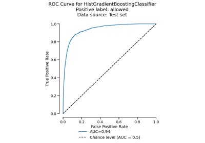
RocCurveDisplay#
- class skore.RocCurveDisplay(*, roc_curve, roc_auc, pos_label, data_source, ml_task, report_type)[source]#
ROC Curve visualization.
An instance of this class should be created by
EstimatorReport.metrics.roc(). You should not create an instance of this class directly.- Parameters:
- roc_curveDataFrame
The ROC curve data to display. The columns are
estimatorsplit(may be null)labelthresholdfprtpr.
- roc_aucDataFrame
The ROC AUC data to display. The columns are
estimatorsplit(may be null)labelroc_auc.
- pos_labelint, float, bool, str or None
The class considered as positive. Only meaningful for binary classification.
- data_source{“train”, “test”, “X_y”, “both”}
The data source used to compute the ROC curve.
- ml_task{“binary-classification”, “multiclass-classification”}
The machine learning task.
- report_type{“comparison-cross-validation”, “comparison-estimator”, “cross-validation”, “estimator”}
The type of report.
- Attributes:
- facet_seaborn FacetGrid
FacetGrid containing the ROC curve.
- figure_matplotlib figure
The figure on which the ROC curve is plotted.
- ax_matplotlib axes or array of axes
The axes on which the ROC curve is plotted.
Examples
>>> from sklearn.datasets import load_breast_cancer
>>> from sklearn.linear_model import LogisticRegression
>>> from skore import train_test_split
>>> from skore import EstimatorReport
>>> X, y = load_breast_cancer(return_X_y=True)
>>> split_data = train_test_split(X=X, y=y, random_state=0, as_dict=True)
>>> classifier = LogisticRegression(max_iter=10_000)
>>> report = EstimatorReport(classifier, **split_data)
>>> display = report.metrics.roc()
>>> display.set_style(relplot_kwargs={"color": "tab:red"}).plot()
- frame(with_roc_auc=False)[source]#
Get the data used to create the ROC curve plot.
- Parameters:
- with_roc_aucbool, default=False
Whether to include ROC AUC scores in the output DataFrame.
- Returns:
- DataFrame
A DataFrame containing the ROC curve data with columns depending on the report type:
estimator: Name of the estimator (when comparing estimators)split: Cross-validation split ID (when doing cross-validation)label: Class label (for multiclass-classification)threshold: Decision thresholdfpr: False Positive Ratetpr: True Positive Rateroc_auc: Area Under the Curve (whenwith_roc_auc=True)
Examples
>>> from sklearn.datasets import load_breast_cancer
>>> from sklearn.linear_model import LogisticRegression
>>> from skore import EstimatorReport, train_test_split
>>> X, y = load_breast_cancer(return_X_y=True)
>>> split_data = train_test_split(X=X, y=y, random_state=0, as_dict=True)
>>> clf = LogisticRegression(max_iter=10_000)
>>> report = EstimatorReport(clf, **split_data)
>>> display = report.metrics.roc()
>>> df = display.frame()
- plot(*, subplot_by='auto', plot_chance_level=True, despine=True)[source]#
Plot visualization.
Extra keyword arguments will be passed to matplotlib’s
plot.- Parameters:
- subplot_by{“auto”, “label”, “estimator”, “data_source”} or None, default=”auto”
Column to use for creating subplots. Options:
“auto”: None for
EstimatorReportandCrossValidationReport, “estimator” forComparisonReport“label”: one subplot per class (multiclass only)
“estimator”: one subplot per estimator (comparison only)
“data_source”: one subplot per data source (
EstimatorReportwith both data sources only)None: no subplots (not available for comparison in multiclass)
- plot_chance_levelbool, default=True
Whether to plot the chance level.
- despinebool, default=True
Whether to remove the top and right spines from the plot.
Examples
>>> from sklearn.datasets import load_breast_cancer
>>> from sklearn.linear_model import LogisticRegression
>>> from skore import train_test_split
>>> from skore import EstimatorReport
>>> X, y = load_breast_cancer(return_X_y=True)
>>> split_data = train_test_split(X=X, y=y, random_state=0, as_dict=True)
>>> classifier = LogisticRegression(max_iter=10_000)
>>> report = EstimatorReport(classifier, **split_data)
>>> display = report.metrics.roc()
>>> display.set_style(relplot_kwargs={"color": "tab:red"}).plot()
- set_style(*, policy='update', relplot_kwargs=None, chance_level_kwargs=None)[source]#
Set the style parameters for the display.
- Parameters:
- policy{“override”, “update”}, default=”update”
Policy to use when setting the style parameters. If “override”, existing settings are set to the provided values. If “update”, existing settings are not changed; only settings that were previously unset are changed.
- relplot_kwargsdict, default=None
Keyword arguments to be passed to
seaborn.relplot()for rendering the ROC curve(s). Common options includepalette,alpha,linewidth, etc.- chance_level_kwargsdict, default=None
Keyword arguments to be passed to
matplotlib.pyplot.plot()for rendering the chance level line. Common options includecolor,alpha,linestyle, etc.
- Returns:
- selfobject
The instance with a modified style.
- Raises:
- ValueError
If a style parameter is unknown.
- static style_plot(plot_func)[source]#
Apply consistent style to skore displays.
This decorator: 1. Applies default style settings 2. Executes
plot_func3. Callsplt.tight_layout()to make sure axis does not overlap 4. Restores the original style settings- Parameters:
- plot_funccallable
The plot function to be decorated.
- Returns:
- callable
The decorated plot function.
Gallery examples#
EstimatorReport: Get insights from any scikit-learn estimator